About Me
Welcome, I'm glad you are here!An analytical mind with a love of learning: that’s me...
Check out my featured projects below.
Analysis of Healthcare Data using MySQL
I was excited to work on this project because healthcare analytics is essential to improving both the quality and affordability of our medical care. Healthcare data analysts play a crucial role in improving patient outcomes, optimizing operations, and managing finances in the healthcare system.I used intermediate SQL to analyze and manipulate data to accomplish five tasks that might be asked of a healthcare data analyst. The tasks are related to data research, patient care, and hospital operations.

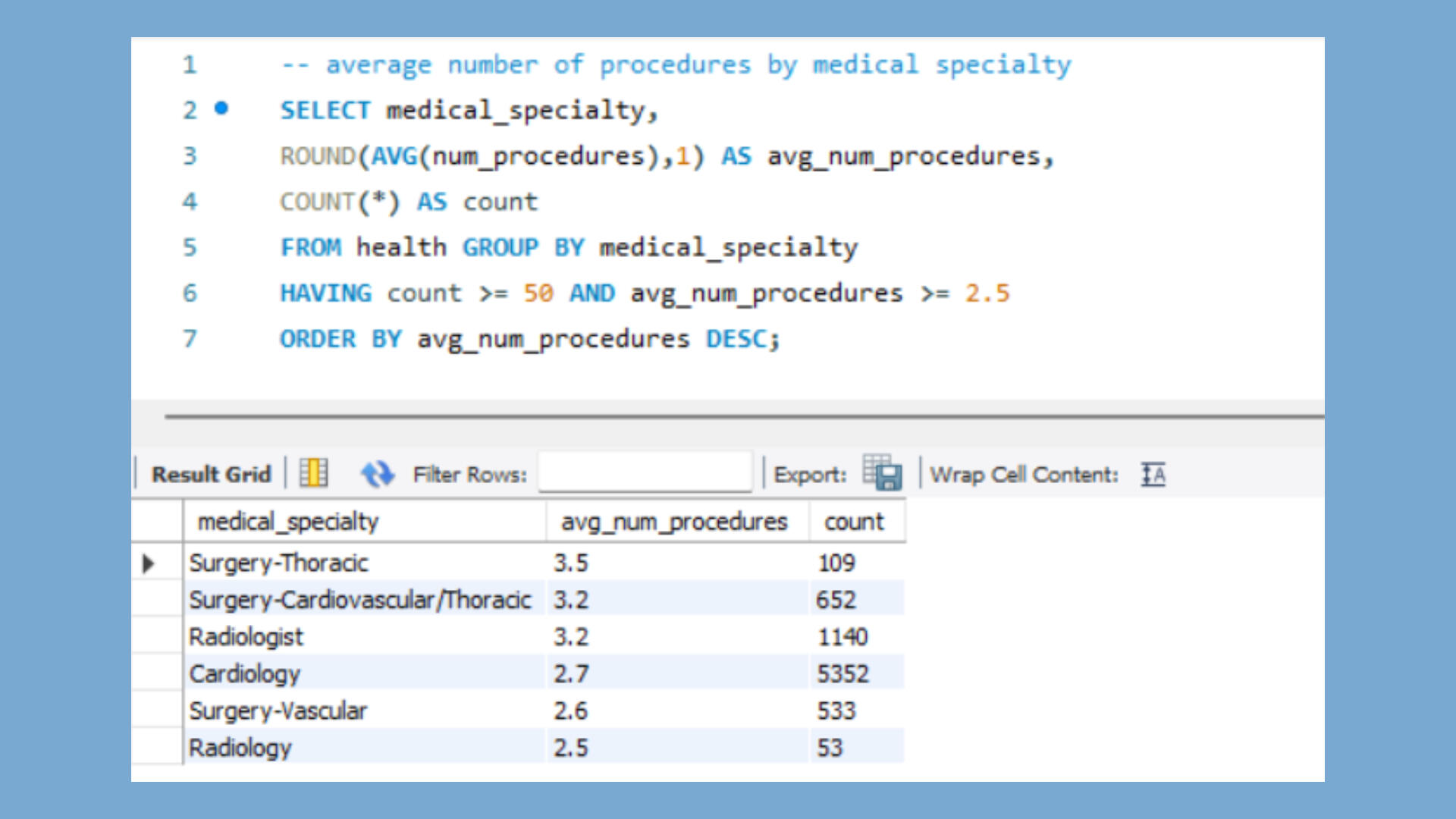
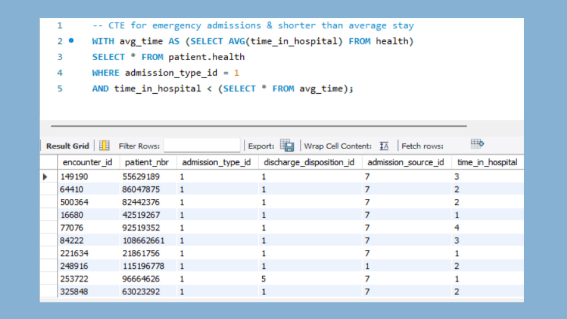
KEY TAKEAWAYSMy primary objective with this project was the opportunity to use intermediate SQL commands and functions to explore, analyze, and manipulate healthcare data. However, I did have some unexpected takeaways.1. Incomplete data and integration of data from a variety of different sources are challenges for data analysts in healthcare.2. I am analyzing data from 130 different hospitals, so the lack of standardized data formats also limits analysis.3. Nevertheless, I thoroughly enjoyed utilizing SQL for healthcare data analytics, despite the "dirty data."SQL TASKS1. Create a list of the medical specialties with average number of procedures per specialty. [Limit to specialties with more than or equal to 50 patients and more than or equal to 2.5 average procedures per patient.]2. Determine if there is a correlation between the number of lab procedures and the length of the hospital stay.3. Examine the possibility of racial, age, and gender bias for the number of lab procedures ordered.4. Create a list of patients who are African American or patients with an increased metformin dosage.5. Create a list of patients with an emergency admission, whose time in the hospital was less than average.DATAThis dataset comes from data collected from 130 US hospitals from 1999-2008. Further details about the specific data criteria can be found at the UC Irvine Machine Learning Repository. I analyze data from two tables, one containing information about hospital visits and one containing patient demographics.ANALYSIS1. Six medical specialties met the criteria of 50 patients and 2.5 average procedures: surgery-thoracic, surgery-cardiovascular/thoracic, radiologist, cardiology, surgery-vascular, and radiology. [Concern: Inconsistent labels for medical specialties suggest that the data needs to be cleaned. Concern: The medical specialty was undefined for 49,949 of 101,766 patients.]
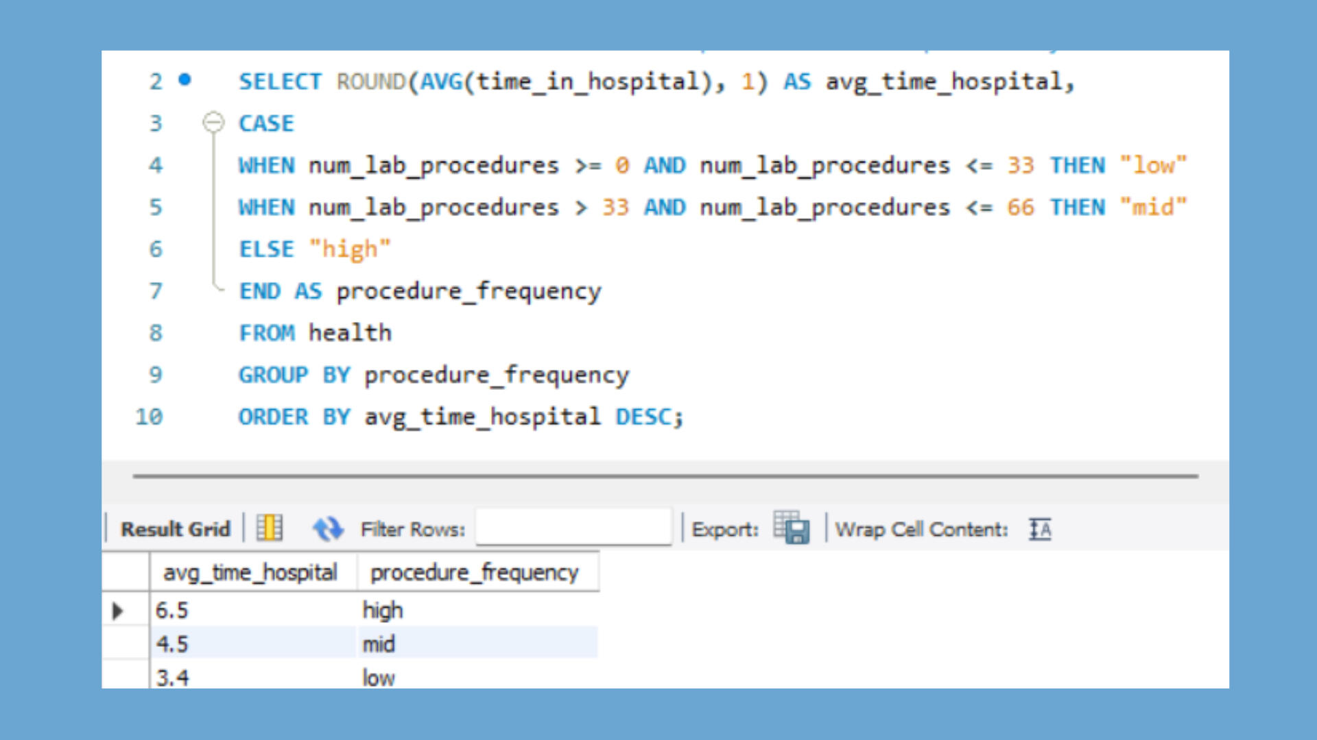
2. As one would expect, a positive correlation exists between the time of a hospital stay and the number of procedures ordered. The longer the hospital stay, the more lab procedures were ordered for the patient.
3. Thankfully, no racial bias appears to exist in the number of procedures ordered. However, there are fewer procedures ordered for Asian patients, which would be interesting to investigate. [Concern: The "?" in the race category data indicates the data is incomplete.]
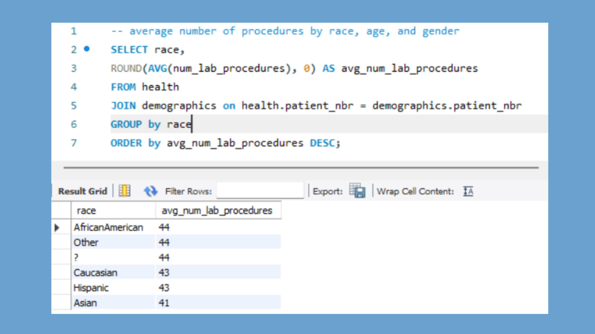
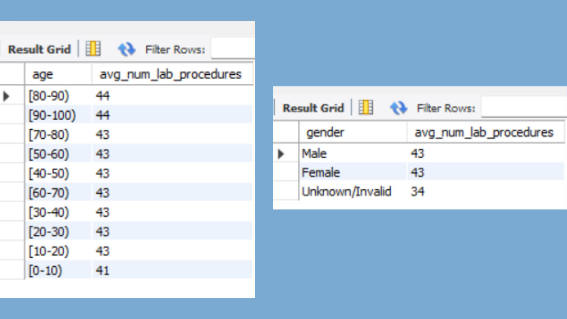
Further, no age or gender bias is indicated. The number of procedures ordered increases with age, but not in a manner that is concerning. Males and females have the same average number of lab procedures. [Concern: As before, I question the quality of the data due to the "Unknown/Invalid" data category for gender.]
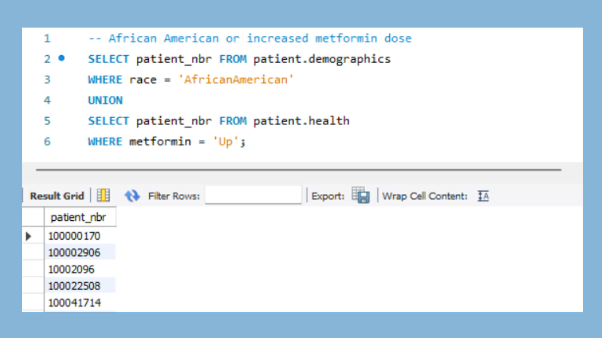
4. This SQL query provides the patient list for those who are African American or who have had their metformin dosage increased.
5. This SQL query returns the patients who were emergency admissions but had shorter than average hospital stays, making them hospital Success Stories.
MAIN TAKEAWAYS
1. Dirty data is a challenge when analyzing healthcare data that has been collected from 130 hospitals. Hopefully, improvements in data collection and data standardization will happen.2. I continue to be excited about the potential to improve patient outcomes, optimize operations, and manage finances in hospitals and insurance companies, through the use of SQL in healthcare data analytics.
Analysis of iFood Survey Data using Excel
At my house in Boise, Idaho, my 20-year-old son spends more money on DoorDash than any other member of the household!This fits with the spending trend in the US, that people in the 18-24 age range are the highest users of DoorDash at 34% of the market. Gen Zers plus Millennials equals 63% of the US DoorDash market!Furthermore, my son's income is a fraction of my income, but he spends more than I do on food delivery.Surprisingly, these two US trends are not true for surveyed customers of iFood, the DoorDash equivalent in South America! Read on for details...

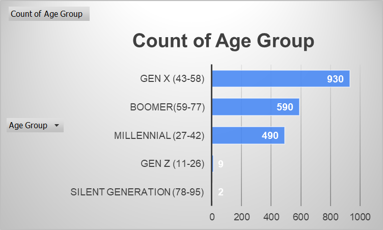
Main Takeaways:1. Most iFood customers in this survey are Gen Xers (43-58 years old).2. The average household income of Gen Z iFood customers in this survey is more than the average household income of Millennials, Gen Xers, or Boomers.3. For iFood customers in this survey, household income is an indicator of the amount of money that will be spent on food delivery.The Data:This dataset was used for a take-home case study in the interview process of data analysts for the iFood delivery company. iFood is the largest online food service in Latin America with an 80% market share and over 70 million monthly orders.The dataset contains results from a 2019 survey of 2240 customers, who were selected at random and contacted by phone and can be found on GitHub: https://github.com/nailson/ifood-data-business-analyst-test/blob/master/ifood_df.csvThe Analysis:
Of the 2020 unique surveys of iFood customers,930 (46%) were Gen X (43-58-year-old age range),
590 (29%) were in the Boomer category (59-77 years old), and
490 (24%) were Millennials (27-42 years old).There were only nine Gen Z customers (11-26 years old) which make up 0.4% of the customers and two Silent Generation customers (aged 78-95) represented which accounted for 0.1% of customers.The vast majority of iFood survey responders are GenX (43-58 years old).However, there is another fascinating twist in the story!
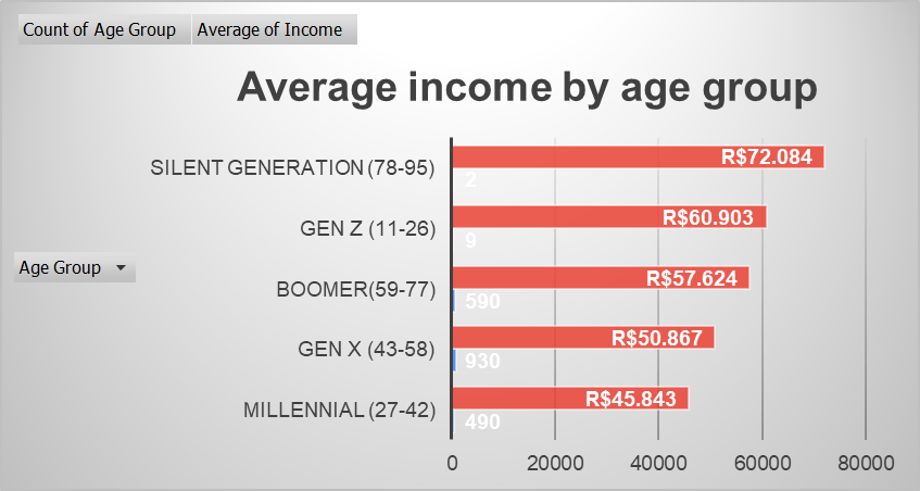
The average income of the nine surveyed Gen Z iFood customers ($R61K) is greater than the incomes of those categorized as Millennials ($R46K), Gen Xers ($R51K), or Boomers ($R58K)! However, it's important to note that only 9 Gen Z customers were surveyed (representing 0.4 % of customers).Those in the Silent Generation had the highest reported income at R$72K, but with only 2 people represented (at 0.1% of customers).The average annual income in Brazil is R$8,6K* Therefore, most of the iFood customers are very wealthy. [In the Brazilian currency real (plural reais), decimal and comma punctuation is opposite of that used in American currency.]How strange that the oldest and the youngest age categories have the greatest income!
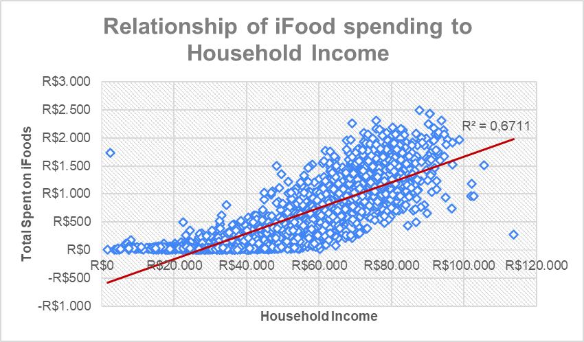
This scatterplot shows the relationship between iFood spending versus income.
As you can see, the trend is that those who make more, spend more. The trendline shows that with 67% accuracy (moderate correlation) if we know a customer's income, we can predict the amount the customer will spend on iFood service.Note: There is one significant outlier where a married person self-reported an income of R$2.447 but spent R$1.729 on iFoods. It's possible that an error was made in the communication of the data. It's also possible that R$2.477 is the income for the non-primary wage earner in the family, even though the respondents were asked for the household income.Generally speaking, the greater the household income, the greater the iFood spending.Concerns:This data was self-reported via phone, so it's possible that people of certain ages were more or less likely to agree to a phone survey, which could skew results about the number of customers by age.Since income is self-reported by customers over the phone to a stranger, it is possible that some customers over-reported and others under-reported their incomes, compromising the dataset.Recommendations:Current results suggest that marketing should be primarily targeted at those with a high income but also targeted at those who are middle-aged.However, with the size of the iFood corporation, I suggest more extensive research so that the marketing strategy will be based on accurate data.
Analysis of MA Education Data using Tableau
This was a fun Tableau project for me because of my years of experience in the public school system, both as a student and as a teacher.Massachusetts has an incredible public education system, one of the best in the United States. They are a data-driven school system and have powerful data visualizations on their website.I am critically examining the school data for the percentage of students who graduate from high school, the percentage of graduates who attend college, the average high school class size, as well as the significance of the class size on college attendance.

KEY TAKEAWAYS1. Massachusetts has an excellent high school graduation rate of 90%.2. High schools with lower graduation rates serve "at-risk" students.3. The class size for most Massachusetts high schools is 12-20 students.4. Interesting outliers arise when comparing class size to college attendance. Keep reading for the fascinating details!DATA SOURCEMassachusetts Department of Elementary and Secondary Education provides data on its website: https://www.doe.mass.edu/DataAccountability.htmlI utilized Tableau to analyze and visualize data from the 2016-2017 school year for 1861 Schools and 953,748 Students.ANALYSIS of High School GRADUATION RATE by High SchoolEach rectangle represents a high school.
Each color change represents a 10% change in graduation rate.
Dark blue = 90-100% graduation rate. Dark orange = 0-10% graduation rate.
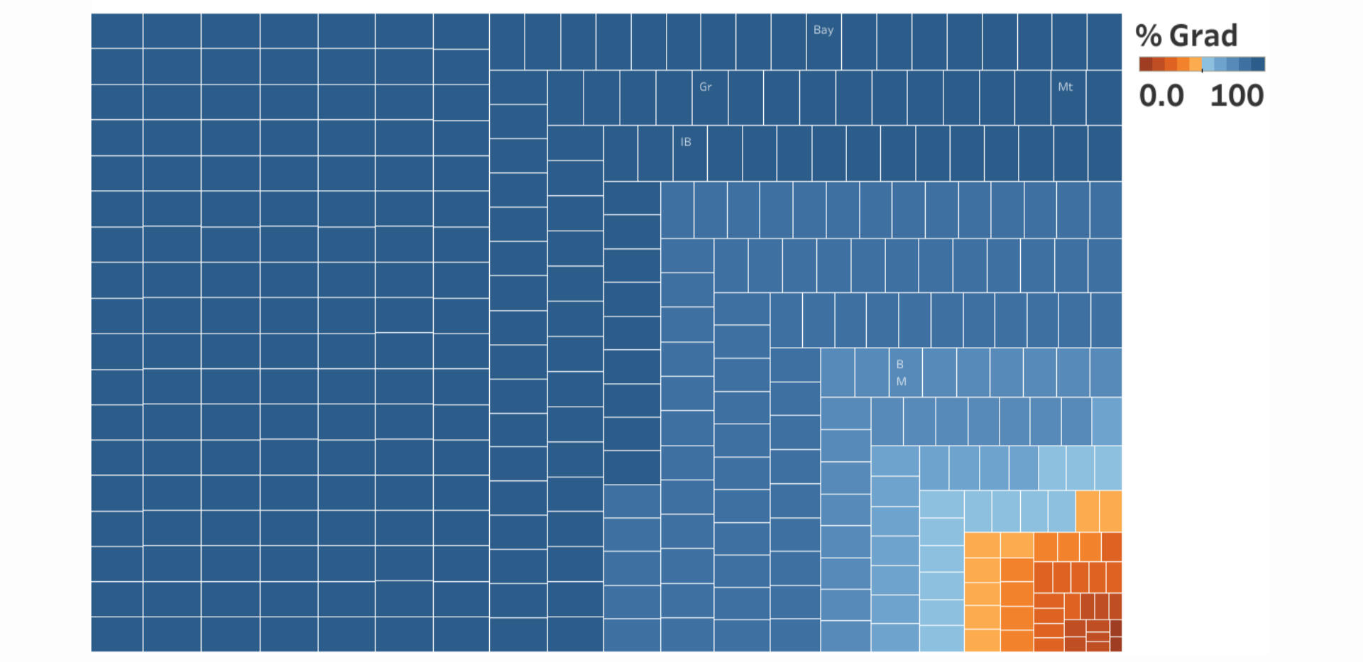
As you can easily see from my visual, most high schools have a very high graduation rate, some even at 100%. The graduation rate for the state is 90%!There are a few schools with low graduation rates. After further research, I discovered that all of the schools with lower graduation rates have a unique student population. These schools all target "at-risk" students in a nontraditional setting."At-risk" students may include those who are pregnant/parenting teens, truant students, suspended or expelled students, returned dropouts, delinquent youth, or other students who are not meeting local promotional requirements.Even with a strong school system, some students will be unable to graduate due to their unique challenges.
Percentage ATTENDING COLLEGE and AVERAGE CLASS SIZE
Each square represents a high school.
Each color change represents a 10% change in the rate of college attendance.
Dark Blue = 90-100% college. Dark Orange = 10-20% college.
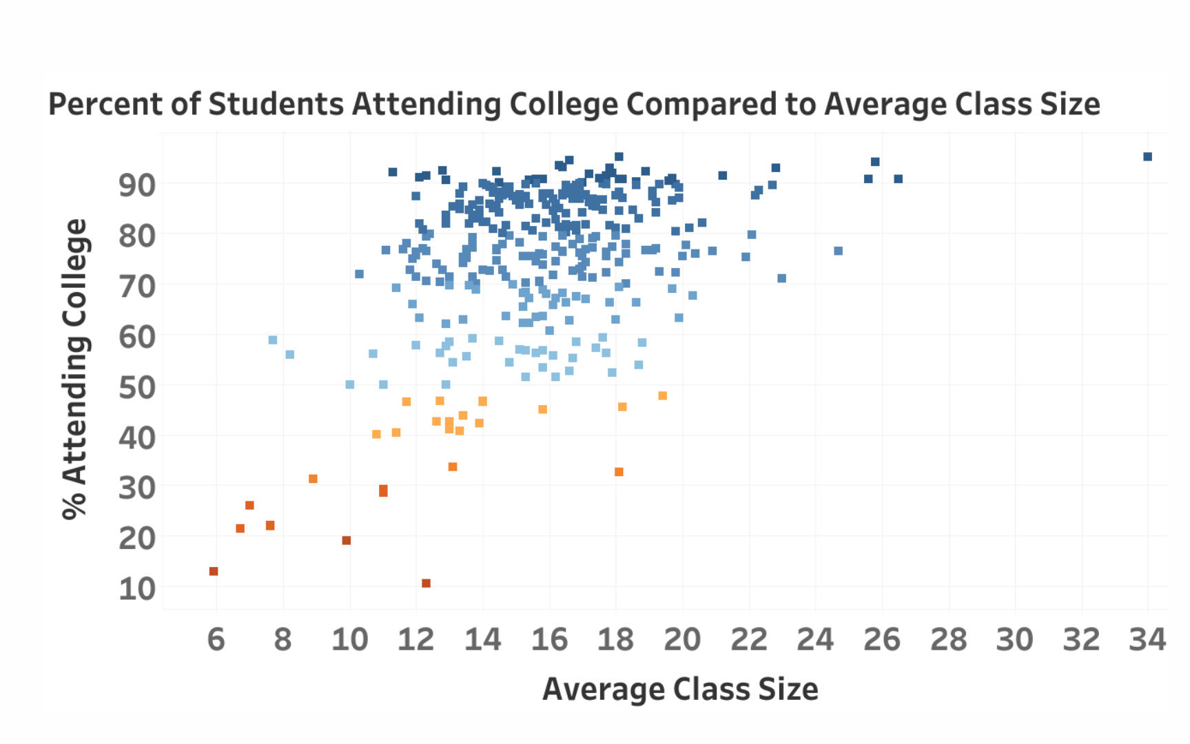
Class sizes are a significant factor in student achievement.After my public school experience teaching with class sizes of 35 students, I was thrilled to see that most schools in Massachusetts contain 12-20 students. This is ideal!However, there are outliers of schools for "high-risk" students which have smaller class sizes, and for charter schools which have higher numbers of students.Massachusetts has 74% of graduates attending college, which is phenomenal.As you can see in the visual, there are some schools with small or average class sizes with low college attendance rates. And then there are others with large class sizes but very high college attendance rates.DIGGING DEEPER is necessary to better understand the outliers:1. Schools with a very small class size are for students who have been identified as “at risk” or having a "disability." Although many of these students do graduate from high school, they are less likely to attend college.2. Schools with regular-sized classes but low college attendance rates were mostly technology high schools. Graduates from these schools can obtain a skilled technology position of employment (with no need to attend college).3. The outliers with high-class sizes and high college attendance rates are mostly exceptional charter schools where the enrollment expectation is that students will attend college.MAIN TAKEAWAYS1. Massachusetts has an excellent graduation rate of 90%. Schools with low graduation rates serve "at-risk" students who have unique challenges.2. The average class size for most high schools is 12-20 students, although there are outliers for schools with unique student populations.3. Even though class size is a significant factor in student success, other factors such as student ability, student behavioral/mental health, and student goals are stronger indicators of college attendance.
Analysis of World Bank Data using MySQL
This was a delightful financial analysis project, as I discovered the extensive beneficial work of The World Bank! The International Development Association (IDA) of the World Bank Group provides low to no interest rate loans to impoverished countries, funded through money from wealthy countries.My younger brother Brent lived and worked in Paraguay for a year between his undergraduate studies and med school. He shared with me his love for the people of Paraguay, as he witnessed their poverty and medical needs. I also learned from Javier, my brother's Paraguayan friend, who came to the US and lived with my parents for a year.Consequently, I chose to focus my analysis on Paraguay, a country with a personal connection, which has recently received money for projects that demonstrate the wide range of beneficial work supported via World Bank loans.

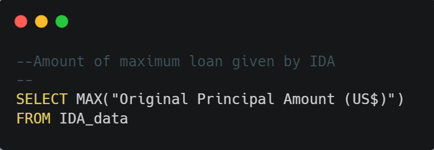
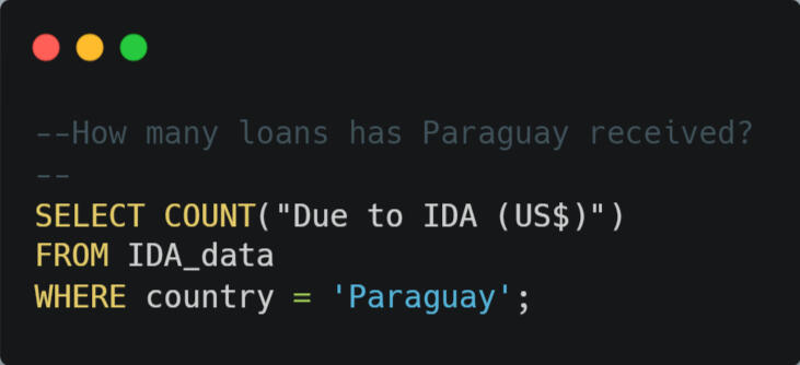
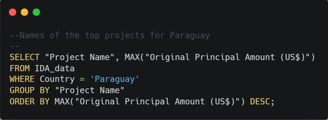
THE DATAThe data comes from the World Bank Group – International Development Association (IDA) and was updated on December 15, 2023.This dataset contains 1.24 million rows of IDA credits or grants, with 30 columns of attributes. Data are given in U.S. dollars and calculated using historical rates.https://finances.worldbank.org/Loans-and-Credits/IDA-Statement-Of-Credits-and-Grants-Historical-Dat/tdwh-3krx/about_dataFOCUSED SEARCH1. Amounts of the maximum loan and average loan given by the International Development Association (IDA).2. Number of loans and amount of money the IDA has loaned to Paraguay.3. Amount of money Paraguay has paid back to the IDA. Amount of Paraguayan debt that has been canceled by the IDA. Amount of money Paraguay currently owes the IDA.4. Top projects where Paraguay has received money from the IDA.SQL ANALYSISSQL is used with large datasets like this one, which contains over a million rows of data. I added notes over each query so that you can quickly understand my thought process and the purpose of the code. Although this is basic SQL code, it was exciting to be able to explore a dataset this large.1. The amount of the maximum loan given by the IDA is $1,200,000,000. The amount of the average loan given is $44,342,096.
2. The IDA has given Paraguay 1216 loans totaling $7,566,959,345.
3. Paraguay has paid $6,656,457,191 to the IDA. The IDA has canceled $9,582,346 of Paraguay’s loans. Paraguay owes $905,230,796 to the IDA.


4. The top 4 projects were Agriculture II ($11,000,000), Livestock II ($9,046,478), Highway Improvement and Maintenance ($7,228,257), and Education I ($5,100,000).

CONCLUSIONIt was exciting to see loans for agriculture and livestock which can help provide Paraguayans with access to necessary food, as well as potential income. Highway Improvement and maintenance can help increase the ability to generate income through business development. And of course, I certainly value any money invested in education for creating better access to opportunities.The people of Paraguay face life-limiting challenges due to their poverty. I'm pleased that affluent countries are providing significant aid through the workings of The World Bank and IDA.

I've always been an analytical problem-solver!
My dad is an engineer and my mom is a mathematician, so there’s probably some genetic component. Yet, when I was a university student, I was completely unaware of the option of a career in data analytics.
Although I enjoyed math and programming courses, I ultimately pursued my interest in languages and communication: studying French, English, and Spanish.My passion for learning and teaching led to a Master's degree in Education. I have thoroughly enjoyed teaching students in both public and private schools, as well as homeschooling my own children.
While researching 2nd career options in 2021, I discovered the wonderful world of data analytics, a perfect fit for my skills and passions!Since that time I've explored data analytics through hands-on learning. In 2023, I committed to working full-time to develop my tech skillset.
Although technical skills are certainly essential, my strengths as a data analyst include the ability to ask strategic questions, listen carefully to stakeholders, and think critically about a problem.My experiences in education, administration, and tech have equipped me to understand the larger context and notice the significant details and have given me a passion for comprehensive problem-solving.Eager to leverage data for solutions in 2024!


